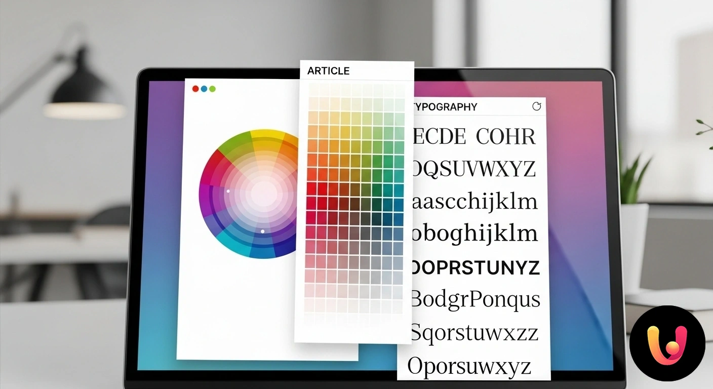
Choosing the colors and fonts for a website is an operation that goes far beyond simple aesthetic taste. These two elements are the heart of visual communication and define the first impression a user has of your brand. In a competitive market like Italy and Europe, where tradition and innovation merge, creating a distinctive visual identity is essential to stand out. Colors and typefaces are not just decorations; they are strategic tools that guide emotions, improve readability, and build trust. A well-considered decision in this area can determine the success or failure of your online presence, influencing how the public perceives your values and professionalism.
This article serves as a comprehensive guide to help you select color palettes and font families. We will explore the principles of color psychology, with a special focus on the cultural nuances of the Mediterranean context. We will analyze how different typographic styles can convey specific messages, from the authority of a historic brand to the dynamism of an innovative startup. The goal is to provide you with the knowledge and practical tools to create a user experience that is coherent, accessible, and, above all, effective in communicating the unique essence of your web project.
The Silent Power of Colors and Fonts
Colors and fonts are the first ambassadors of your brand online. Even before a user reads a single word, their brain processes the color stimuli and the shape of the letters, forming an instinctive opinion. Color psychology studies precisely how different shades influence our perceptions and evoke emotional reactions. According to some research, up to 90% of first impressions of a product can be based solely on color. This impact is so profound that it can influence purchasing decisions and the perceived reliability of a company. Similarly, typography defines the personality of a text: a font can appear authoritative, friendly, modern, or traditional, influencing the readability and the overall tone of voice of the site.
Color Psychology in the Italian and Mediterranean Context
The perception of colors is not universal but is strongly influenced by culture. In the Italian and Mediterranean context, colors take on specific meanings tied to history, nature, and lifestyle. Understanding these associations is crucial for creating a site that genuinely resonates with the local audience. The Italian flag, with its green, white, and red, evokes meanings related to the landscape and national history. “Azzurro” (light blue), although not in the tricolor, is an identifying color, a symbol of national sports teams and linked to the House of Savoy, conveying trust and serenity. At the same time, warm earth tones, like terracotta and ocher, recall an imagery of craftsmanship and human warmth.
Warm Colors: Passion, Energy, and Tradition
Warm colors like red, orange, and yellow are full of energy and capable of immediately capturing attention. Red is the color of passion, energy, and, in commercial contexts, urgency, often used for promotions and calls-to-action. In Italian culture, it is also linked to luxury and excellence, as demonstrated by iconic brands in the automotive and fashion industries. Orange communicates enthusiasm and creativity, ideal for brands that want to appear friendly and dynamic. Yellow, the color of the sun, evokes optimism and happiness, but it should be used with caution as overuse can cause eye strain. Softer shades, like earth tones, create a warm, rustic, and welcoming atmosphere, perfect for brands tied to tradition, food and wine, and craftsmanship.
Cool Colors: Trust, Professionalism, and Innovation
Cool colors, including blue, green, and purple, tend to convey feelings of calm, trust, and professionalism. Blue is the most popular color in marketing for its ability to communicate reliability and security, making it a preferred choice for tech, financial, and healthcare companies. Green is universally associated with nature, sustainability, and growth. It is the ideal choice for eco-friendly brands, wellness brands, or anyone wanting to communicate freshness and balance. Purple, historically linked to royalty, evokes luxury, creativity, and spirituality, positioning it as a suitable choice for high-end products, cosmetics, or exclusive services. These colors, when used in lighter shades, can also contribute to a minimal and modern aesthetic.
How to Create the Perfect Color Palette for Your Brand
Creating an effective color palette is not a random process but follows principles of harmony and strategy. A very popular approach is the 60-30-10 rule, which helps to balance colors in a pleasing way. This rule suggests using a dominant color for 60% of the design (often for backgrounds), a secondary color for 30% (for important elements like specific sections), and an accent color for 10% (for calls-to-action, links, and details to be highlighted). The dominant color sets the overall mood, the secondary one adds depth, and the accent color guides the user’s eye to the most important actions. It is crucial that the chosen colors are consistent with the brand’s identity and values.
The Typographic Soul: Choosing the Right Font
Typography is the visual voice of your site. Choosing the right font is crucial because it influences readability, mood, and brand perception. A typeface is not just a set of letters but a powerful design element that communicates a specific personality. On the web, readability is the top priority: a text that is difficult to read drives users away and nullifies the message. Therefore, the choice must balance aesthetics and functionality, ensuring that content is easily accessible on screens of different sizes. A good starting point is to explore libraries like Google Fonts, which offer a wide selection of web-optimized fonts.
Serif, Sans-Serif, and Script: A Message for Each
Font families are mainly divided into three categories, each with its own psychological impact. Serif fonts, which have small decorative strokes (the “serifs”) at the ends of the letters, evoke tradition, elegance, and authority. They are often used for long texts on paper and, on the web, for sites that want to convey a classic and refined image, such as those of law firms or luxury brands. Sans-Serif fonts (without serifs) have a clean, modern, and minimalist look. They are considered more readable on digital screens and are the most common choice for body text on the web, communicating clarity and professionalism. Finally, Script or calligraphic fonts mimic handwriting and add a personal and creative touch, but their low readability makes them suitable only for short elements like logos or impactful headlines.
Practical Rules for Pairing Fonts
Limiting the number of fonts to two, or at most three, is a golden rule for maintaining a clean and coherent design. An effective strategy is to pair a Serif font for headings with a Sans-Serif font for the body text, or vice versa. This creates a visual contrast that improves hierarchy and readability. When pairing fonts, it’s important to choose typefaces that harmonize with each other but are different enough to create a clear distinction between headings and paragraphs. For example, you can combine a font with a heavy weight (bold) for headings with a lighter one for the text. The goal is to create a visual hierarchy that guides the user through the content naturally and intuitively.
Balancing Tradition and Innovation: An Italian Approach
The “Made in Italy” label is a brand heritage that evokes values of creativity, culture, and elegance. In web design, this translates into the ability to balance rich artisanal tradition with the drive for innovation. A company producing organic olive oil might choose a palette of greens and earth tones, paired with an elegant Serif font like Garamond to communicate authenticity and quality. Conversely, a Milan-based fintech startup might opt for a bright blue and a neutral gray, using a modern, geometric Sans-Serif font like Futura or Montserrat to convey efficiency and innovation. The important thing is that the visual choices reflect a conscious brand strategy, capable of uniting history and the future.
Accessibility and Readability: Absolute Priorities
An aesthetically pleasing design is useless if it is not accessible to everyone. Web accessibility ensures that people with visual disabilities can also navigate the site without difficulty. A fundamental aspect is the color contrast between text and background. The international WCAG (Web Content Accessibility Guidelines) recommend a minimum contrast ratio of 4.5:1 for normal text. There are numerous free online tools to check for this compliance. In addition to contrast, it is essential to choose appropriate font sizes and not to use all-caps text, which is harder to read. A responsive design that adapts typography to different devices is another pillar for ensuring an optimal and inclusive user experience.
The strategic use of bold and italics, combined with a good content structure, falls under the practices of SEO copywriting, which improve both readability for the user and scanning by search engines. Choosing a WordPress theme that offers ample customization options for colors and fonts can greatly simplify the implementation of these best practices, allowing you to create a website that is not only beautiful but also functional and accessible to all.
In Brief (TL;DR)
Learn to select the perfect color palette and fonts to communicate your brand’s identity and ensure an optimal user experience.
We will guide you through the principles of color psychology and typography to help you create a readable, professional, and visually impactful site.
We will delve into how color psychology and typography principles are essential for creating a strong visual identity and a flawless user experience.
Conclusion

Choosing colors and fonts is a foundational act in creating a website, an operation that shapes the brand’s identity and the user’s experience. As we have seen, this is not a decision based solely on aesthetics, but a strategic choice grounded in psychology, culture, and specific communication goals. In the Italian and Mediterranean context, this means knowing how to interpret a rich visual heritage to engage authentically with your audience, balancing tradition and modernity. From the color palette that evokes specific emotions to the font family that defines the tone of voice, every element helps build a coherent and recognizable narrative. Remembering the priorities of readability and accessibility is not just a technical obligation but an act of respect for every user, ensuring an inclusive and high-quality experience. Investing time and thought into these choices means laying the groundwork for effective communication and a solid online presence.
Frequently Asked Questions

For a balanced and professional design, it is recommended to follow the 60-30-10 rule. This technique, originating from interior design, suggests using three colors: a primary color (60%) for backgrounds and larger areas, a secondary color (30%) for elements like the header or specific sections, and an accent color (10%) to highlight important elements like buttons and links. This approach creates visual harmony and guides the user through navigation.
To pair fonts effectively, it is advisable to limit yourself to two or at most three typefaces. A common practice is to combine a serif font (with serifs) for headings with a sans-serif font (without serifs) for the body text, or vice versa, to create a pleasant contrast and improve readability. The important thing is that the chosen fonts, while different, share a similar style or mood to ensure visual consistency for the project. Tools like Google Fonts offer a wide selection and make it easy to choose harmonious font pairs.
The most common mistakes include using too many fonts or colors, which makes the design chaotic and unprofessional. Another serious mistake is poor contrast between the text and the background, which severely compromises readability. It is also important to avoid overly decorative or calligraphic fonts for long texts and not to overdo the use of bold and italics. Finally, choosing colors or fonts that are not in line with the brand’s identity can confuse the message you want to convey.
Yes, there are numerous free and professional online tools. For creating color palettes, Adobe Color and Coolors are among the most popular, allowing you to explore thousands of combinations and create new ones. For choosing and pairing fonts, Google Fonts is an indispensable resource, offering a vast library of open-source, web-optimized fonts. There are also tools like Stylify.me that analyze an existing website to show its colors and fonts.
To ensure readability on every device, it is essential to adopt a responsive design, which automatically adapts the layout and text sizes to the screen. Use sans-serif fonts like Arial or Roboto, known for their clarity on smaller displays. Ensure high contrast between text and background and an adequate font size (at least 16px for paragraphs is a good starting point). It is also crucial to leave enough white space between elements to avoid overloading the page and to improve the reading experience.
Still have doubts about Colors and Fonts: The Guide to Choosing the Style and Soul of Your Site?
Type your specific question here to instantly find the official reply from Google.


Did you find this article helpful? Is there another topic you’d like to see me cover?
Write it in the comments below! I take inspiration directly from your suggestions.