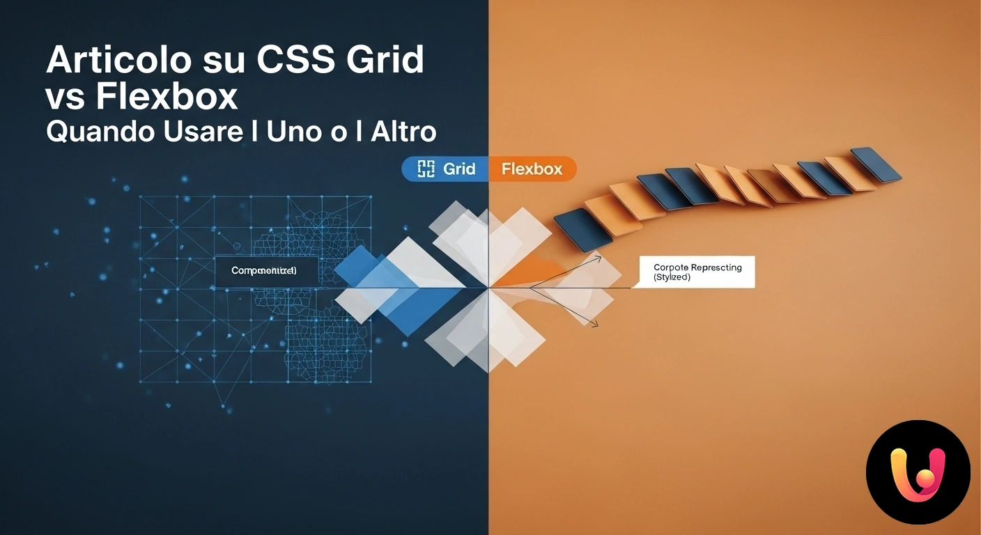
In the world of web design, creating effective and responsive layouts is fundamental. For years, developers relied on complex techniques to position elements on a page. Today, thanks to two powerful CSS tools, Flexbox and Grid, this process has become more intuitive and flexible. Although both are used to create layouts, they operate in fundamentally different ways. Understanding their differences is crucial for choosing the right tool for each project, balancing aesthetics and functionality, much like a craftsman choosing the perfect chisel for their work.
Imagine having to furnish a room. You would use one approach to arrange pictures on a single wall and another to organize the entire floor plan of the house. Similarly, Flexbox and Grid meet different needs. The former is ideal for aligning items along a single dimension, like a row of books on a shelf. The latter, however, is perfect for creating complex two-dimensional structures, similar to the grid of a newspaper page. The choice between the two is not a competition, but a strategic decision to build websites that blend tradition and innovation, ensuring a flawless user experience.
Flexbox: The Master of One-Dimensional Alignment
CSS Flexbox (Flexible Box Layout) is a layout model designed to arrange, align, and distribute space among items within a container, even when their sizes are unknown or dynamic. Its strength lies in managing one-dimensional layouts, meaning on a single row or a single column. This makes it the perfect tool for interface components like navigation bars, where you need to horizontally align a series of links and buttons, or to vertically center a block of text within a section. Its ‘content-first’ logic allows elements to flexibly adapt to the available space.
Think of Flexbox as a system for organizing a line of people: you can decide whether to arrange them in a row or a column, how they should align, and how to distribute the space between them. Properties like justify-content and align-items offer precise control over alignment along the main and cross axes. This simplicity makes it ideal for small layouts and specific components. For those who want to delve into the basics, the guide to HTML and CSS is an excellent starting point for mastering the fundamentals of web development.
When to Use Flexbox: Practical Examples
Flexbox excels in specific scenarios where flexibility and alignment on a single axis are a priority. It’s the ideal choice for creating a responsive navigation bar, where links distribute evenly and adjust on smaller screens. Another common use case is centering elements, both horizontally and vertically, a historically complex task that Flexbox solves with just a few lines of code. It’s also perfect for creating cards or product galleries where items need to have the same height, regardless of the amount of content inside, ensuring a neat and professional look.
Additionally, Flexbox is great for managing the layout of elements within a form, such as aligning labels and input fields, or for positioning a group of action buttons. Its ability to visually reorder elements without changing the HTML structure is another notable advantage, useful for adapting the interface to different contexts. Leveraging Flexbox for these tasks not only simplifies the code but also improves the project’s maintainability and scalability, key aspects for effective responsive design.
CSS Grid: The Architect of Two-Dimensional Layouts
While Flexbox handles one dimension, CSS Grid was designed for two-dimensional layouts, allowing you to control rows and columns simultaneously. This makes it an incredibly powerful tool for structuring the entire layout of a web page, like the classic ‘Holy Grail’ layout with a header, footer, main content, and two sidebars. Unlike Flexbox, which starts with the content to define the space, Grid takes a ‘layout-first’ approach: you first define the grid and then place the elements within it. This offers granular control over the position and size of each component.
Imagine designing a magazine: CSS Grid allows us to define specific areas for titles, images, and columns of text, creating complex and asymmetrical compositions with ease. Properties like grid-template-columns, grid-template-rows, and grid-template-areas allow you to build sophisticated layouts in a declarative and intuitive way. This ability to manage the entire page makes it essential for modern web design, where the structure must be solid yet adaptable. A well-structured layout is also the foundation for good UX design, as it guides the user through the content logically and predictably.
When to Use Grid: Ideal Scenarios
CSS Grid is the preferred solution when dealing with the overall structure of a page. It’s perfect for defining macro-areas like the header, main body, sidebar, and footer. Its two-dimensional nature makes it ideal for creating complex dashboards, portfolio-style image galleries, or magazine-like article layouts where elements can span multiple rows and columns. Thanks to Grid, it’s possible to create asymmetrical and creative designs that would be very difficult to achieve with other methods, without sacrificing order and readability.
Another significant advantage is the management of space between elements. The gap property allows you to define uniform spacing between grid cells, eliminating the need for margins and greatly simplifying the code. This is particularly useful for creating responsive card grids that automatically adjust the number of columns based on the available space. Using Grid for the main layout, combined with a good strategy for H1, H2, H3 heading structure, creates a solid foundation for both user experience and SEO.
Flexbox and Grid: A Winning Combination
The question shouldn’t be “Grid or Flexbox?” but rather “How can they work together?”. These two tools are not rivals, but powerful allies. The most effective approach in modern web design is to use Grid for the macro-layout (the overall page structure) and Flexbox for the micro-layout (the alignment of components within it). For example, you can use Grid to define a header, main, and footer, and then apply Flexbox inside the header to align the logo to the left and the navigation links to the right.
This combination leverages the best of both worlds. Grid provides a solid, two-dimensional structure, while Flexbox offers the flexibility needed to manage the alignment and distribution of content within individual modules. An element managed by Grid can easily become a Flexbox container for its children, and vice versa. This hybrid approach allows for the creation of complex, responsive, and easy-to-maintain interfaces, demonstrating how technological innovation can seamlessly integrate with the principles of balanced and functional design, a value deeply rooted in Mediterranean and Italian aesthetic culture.
In Brief (TL;DR)
Discover the fundamental differences between CSS Grid and Flexbox to understand which of these two modern CSS layout systems is best suited for your web design needs.
Learn to distinguish their strengths to confidently choose the most suitable tool for every layout need, from simple alignments to complex grids.
We will analyze the main differences to help you confidently choose the right tool for every layout.
Conclusion

In summary, both CSS Grid and Flexbox are indispensable tools in every modern web developer’s toolkit. The choice between the two depends entirely on the context. Flexbox is the ideal solution for one-dimensional layouts: perfect for aligning items in a row or column, like navigation menus or groups of buttons. Its strength lies in its flexibility and ability to distribute space based on content.
On the other hand, CSS Grid is the master of two-dimensional layouts, offering precise control over rows and columns simultaneously. It is the preferred tool for defining the core structure of an entire page, organizing complex areas with clean and understandable code. True mastery, however, emerges when you learn to combine them: using Grid for the overall architecture and Flexbox for the internal details. This hybrid approach allows you to build websites that are not only functional and responsive but also elegant and well-structured, embodying a balance between tradition and innovation.
Frequently Asked Questions

The fundamental difference lies in their dimensionality. Flexbox is designed for one-dimensional layouts, meaning for arranging items in a single row or column. CSS Grid, on the other hand, is a two-dimensional system that manages both rows and columns simultaneously. In practice, you use Flexbox to align content, like menu items, and Grid to define the overall page structure.
Use **Flexbox** for small-scale components and for aligning items along a single axis. It’s perfect for navigation bars, centering elements, or organizing content within a card. Use **CSS Grid** for the overall page layout, when you need to organize complex areas like a header, sidebar, main content, and footer. Grid is the ideal choice when you need control over rows and columns at the same time.
Absolutely. In fact, it’s considered a best practice. Grid and Flexbox are not alternatives, but complementary. A very common and effective strategy is to use Grid to define the macro-structure of the page and then apply Flexbox to align and distribute elements within the individual areas created with Grid.
Both are excellent for responsive design, but they work in different ways. Flexbox is great for making elements adapt and redistribute based on available space, for example, by moving from a single row to multiple rows on small screens (so-called ‘wrapping’). Grid allows you to completely redefine the layout structure based on different screen sizes in a very powerful way, reorganizing grid areas with just a few lines of code. Combining the two offers maximum control.
Yes, both have excellent support across all modern browsers like Chrome, Firefox, Safari, and Edge. Flexbox has slightly broader support on older browser versions, as it was introduced earlier. However, as of today, you can safely use both Grid and Flexbox for most web projects, ensuring great compatibility.
Still have doubts about CSS Grid vs. Flexbox: Which to Use and When??
Type your specific question here to instantly find the official reply from Google.


Did you find this article helpful? Is there another topic you’d like to see me cover?
Write it in the comments below! I take inspiration directly from your suggestions.